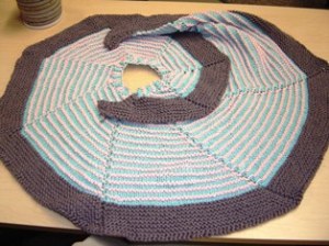
Multi-color scarves and shawls are all the rage at Ravelry right now. One of the most popular patterns now is one called Color Affection. This pattern uses at three colors of sock or lace weight yarn. I just finished a shawl like this called Geyser Stretch by Stephen West, a new favorite designer of mine. While I still love the colors I selected, I am not as happy with the results as I believe I could be. This result has birthed a new blog post which is something I needed to do again anyway. I want to tell you about my color selection process and where I went wrong.
The most challenging part of many craft processes is often color selection. I have been a practitioner of many crafty hobbies throughout my 50 years. I have witnessed others struggle with color selection in all of them. I don’t mean to sound as though I don’t struggle as well because this project is proof that, even at my age, I still struggle.
When it comes to knitting and beading projects most people select the pattern first. This is the logical starting point. As the owner of a bead and yarn shop my approach, out of necessity, tends to be a little lopsided. In knitting for the shop my first choice is usually the yarn. Whenever I get a new yarn in the shop I tend to scramble to get a sample made to promote the product. So I will tell you my process with this shawl and many other projects I knit for the shop.
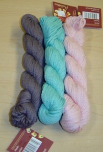
In this particular instance I needed to make a shop sample using a new yarn called Asikita. Once I decide on the yarn to make a sample with my next task is usually to find a project. This is where Ravelry becomes indispensable to me. The search function in Ravelry defaults to searching for a pattern. But this function can be used to search all kinds of things including designers and yarn. By typing the name of the yarn I have selected into the search window, and then selecting “yarns” in the drop down menu, I can find the yarn in their data base. When you do this search it is possible to get more than one suggested yarn. Select the correct yarn from the list and you can then navigate to the projects that members have made using that specific yarn. By doing this search I came up with the Geyser Stretch pattern. Once the pattern was selected, the next task was to choose the colors.
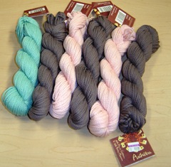
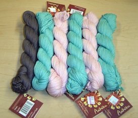
I had 8 colors to choose from for this project and needed to select three of them for the project. I am particularly fond of the combination of turquoise and brown. I gravitated to those two colors first. The third color was a little harder to select. I auditioned the cream but found it seemed a little bland. Since I also like pink and brown I started to look at that color for number three. I also love pink and grey and the brown selected has grey undertones so that seemed like it would be a good third color. When you look at the three colors laid together in skein form they still look really good together. The next step then became assigning A, B, and C to the colors.
I decided that I wanted to make sure that the turquoise and brown touched each other yet I didn’t think using those two colors for the stripes would work. This thought led to the decision to stripe the pink and the blue. I then read the pattern to see which of these colors should be assigned as color A to ensure that the blue and the brown would touch. This thought process led to A being the turquoise, B being the pink, and C being the brown. Once these decisions were made it became time to start the knitting. It did not take long to realize I had not completely thought my colors through.
There were a couple of steps in the color selection process I neglected.
The first thing I should have done was to list out all the possible combinations that could be made with these three colors. For this pattern and these colors there were three different combinations. There was one combination I never even considered. I never considered using the brown and the pink for the stripes and the blue for the border. In my mind I had made one assumption that I never tested. I assumed I needed to place my darkest color on the border. This approach to color and borders comes from my background in piecing quilts. I either puts lights and mediums in the body and darks in the border, or I put mediums and darks in the body and lights in the border. My preference is the former. In any event I want to set-up contrast. I considered the pink in the shawl a light, the turquoise a medium, and the brown a dark. With this particular paradigm I was left with only two options; the one I used and the one I rejected. The third option was to stripe the body with the light and the dark; the pink and the brown; and use the medium for the border. Do you think that is the way I should have gone with this projects?
The other part of the process I completely neglected was to do a mock color layout. Doing a mock color layout means taking your skeins of yarn and laying them out in the order they will be knit to get a more concrete sense of how the finished project will look. If I had performed this step there are two things I did not anticipate that may have very well become obvious. The mock layout would have undoubtedly revealed to me that striping the pink and blue would reveal a garment that would look like a baby garment. It is also highly likely that I would have realized that there was yet another option available to me that I did not yet see.
What is the moral of this story? The moral of this story is two-fold. First of all you need to create as concrete as possible an image of your anticipated garment. Secondly you need to learn to identify personal paradigms that cause you to neglect certain options available to you. In other words; Play around with your color as much as possible before you get out the needles. Have FUN with your colors! They are not to be feared. I may not be as happy with my shawl as I would like to be but I still like my shawl.


